The concept of ‘Color Grading’ has recently become part of the still photography workflow, but it’s been a mainstay in the motion picture industry for many years. As opposed to ‘Color Editing’—selecting a color and changing its appearance somewhat or fixing color problems within the image—‘Color Grading’ is affecting the overall look and feel of an image. In filmmaking, color grading is used to set the mood and unify the movie. You can do the same thing with your stills. Think of a sepia-toned print. It’s not pure black and white, it has a tint throughout the photograph. Expand that concept a little more to taking control of tints across the tones in an image, and you have yourself a color grade.
Color Grading in Capture One
There is a specific, simple-to-use tool for color grading in Capture One. No special tricks or complex workarounds are required. It’s found in the Color tool tab and labelled as the Color Balance tool.
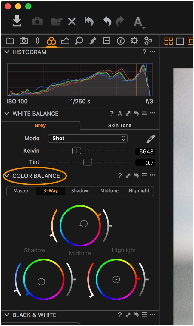
The Color Balance Tool. This tool is divided into three color wheels. Each wheel has the same function affecting the Shadows, Mid Tones or Highlights.
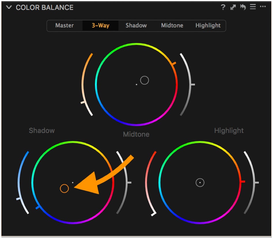
Cooling the shadow areas with a simple edit
- Click-drag the central point to push the color in that direction
- To Reset any of the color wheels to the center, double-click anywhere in the circle
- To preview your color grade, Option (Mac) / Alt (PC) click the reset icon in the color balance tool. It’s the small icon at the top, that looks like a rear pointing arrow
The density of each tone can also be edited throughout the image with the slider on the right side of the color adjustment wheel. Simply pull down to darken and up to lighten. This is an incredibly simply way to influence contrast in the image.
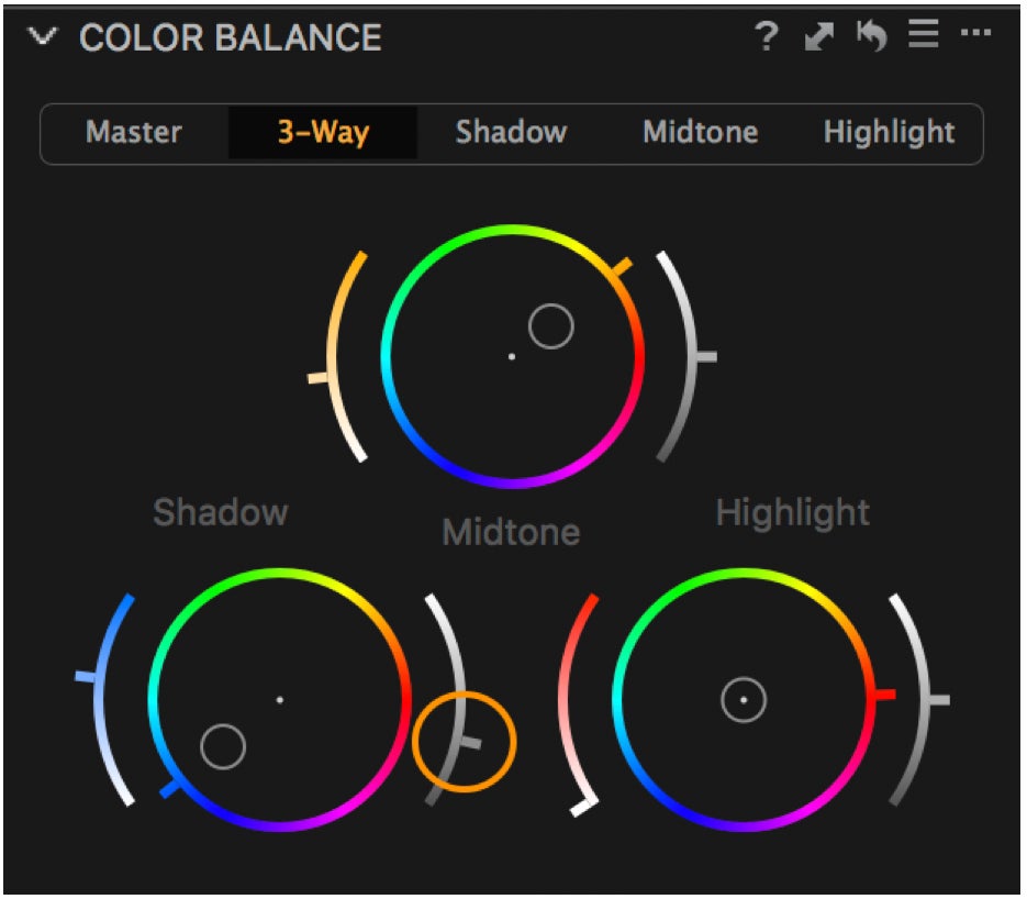
Darkening the shadow areas
Here is the same photo with and without the Color Grade. It’s a subtle change but certainly contributes to the feel and aesthetics.
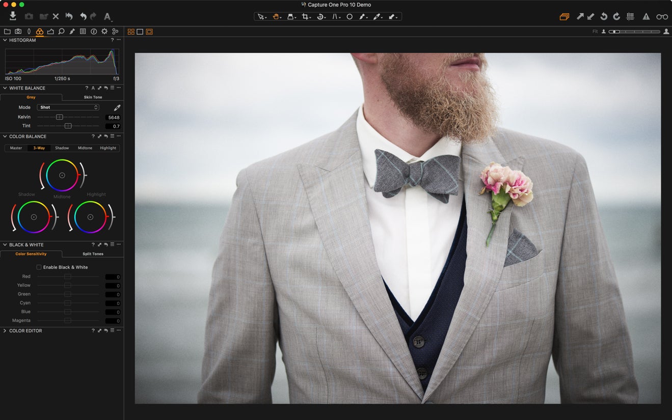
No color grade.
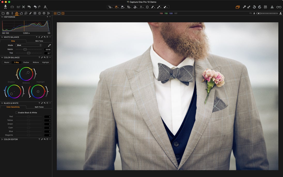
With a color grade applied. Note the warmer look in the skin tones and the jacket and the cooler look in the blacks. Instead of applying a single color-cast over the image, we're controlling the tints in each range of tones in the photo.
If you have the monitor space, the Color Balance tool can also be dragged into the main viewer and enlarged by dragging the corner. This way finer adjustments can be made with ease.
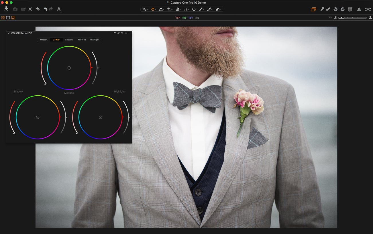
You can get finer control by enlarging the Color Balance tool. If you have a big monitor, this is a great way to work with the tool. Also the Shadow, Midtone and Highlight color wheels can be viewed individually in their respective tabs.
Finally, the ‘Master’ tab presents just a single wheel allowing one color tint to be applied to the image. It’s much like simply placing a color filter on your lens.
Color grading is a very powerful way to influence the mood in an image or a series of images. Using the Color Balance tool in Capture One gives you a fast and easy way to grade your photos. You can experiment and create your own color grades quickly with no need to learn about color mixing or blending. Try it.
This article is part of a series on post-production workflow with Capture One. As a Sony camera owner, you get Capture One Express (for Sony) with your purchase. This series of articles will show you how to get more out of the software. Of course, you don’t have to be a Sony shooter to make use of these tips. They’re for anyone who wants to use Capture One.
About the author:
David Grover is a Capture One expert based in the UK. In addition to writing a weekly column for Alpha Universe, he runs the Capture One weekly webinar series on Capture One Pro 10 and produces a series of video tutorials on Capture One as well.
If you're just getting satrted with Capture One, check out this tutorial.


