David Shockey is a Willoughby, Ohio–based landscape and wildlife photographer and co-owner of Capture On Labs, a professional fine art printing and custom framing lab. His work spans landscapes, wildlife, and astrophotography, with a focus on creating photographs that hold up as large-scale finished pieces. Drawing on both his experience behind the camera and years of helping photographers turn digital files into artwork for their walls, David shares practical guidance for making prints that feel as intentional as the moments that inspired them.
We spend a lot of time taking photographs. We plan trips, wait for the light, and spend time editing. Then we post the image online and move on to the next one. Printing gives us a reason to slow down and spend more time with what we’ve created.
I’m a landscape and wildlife photographer and co-owner of Capture On Labs, a fine art printing and custom framing shop in Willoughby, Ohio. I make photographs for my own walls and help other photographers bring theirs into print. Many of our conversations at the lab start with the same questions: How big can I print this? Which paper should I choose? How should I frame it?
A finished print reflects decisions that start with the camera. I’ll walk through shooting, editing, preparing your file, and choosing materials and framing that support the photograph.
Shoot With Purpose
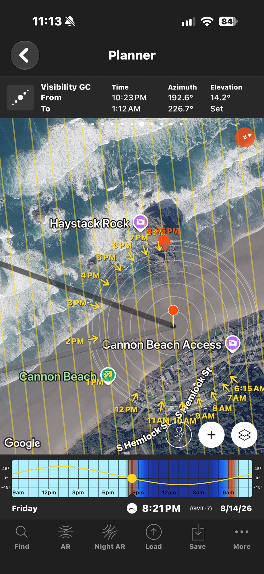
Shooting with purpose doesn’t mean every outing needs an elaborate plan. You can go out for fun and still be intentional about what you include in the frame and what drew you to the scene. One of my favorite planning tools is PhotoPills. I use it to check sun and moon positions and plan Milky Way alignments. Knowing where the light will come from can help you decide when to arrive and where to stand, whether you’re photographing a landscape, wildlife, or a portrait session. Planning doesn’t guarantee a great photograph, but it helps you be ready.
Give Yourself Options In The Field
Start with composition. Look around the edges for distractions, watch for overlapping elements, and give your subject room to breathe. Leading lines can guide the eye, while foreground elements can add depth. Changing your position, camera height, or focal length can strengthen the composition and remove distractions before they become editing tasks. You won’t always have that opportunity during a fleeting wildlife encounter, but use it when you do.
Consider the final crop, too. A 3:2 image needs cropping or added borders to fit an 8 × 10-inch or square print. If you have a particular format in mind, leave enough room around important elements to accommodate it.
As a landscape photographer, I used to think wider was always better. Some of my favorite images now were taken with my 70-200mm f/2.8 G Master. It lets me isolate what caught my attention without including the entire scene. One photograph I made with that lens and my Alpha 7R V became a 40 × 60-inch metal print for my exhibition, Stand Out.
Some scenes benefit from capturing multiple frames to blend later:
-
Exposure bracketing helps when a bright sky and dark foreground exceed what you can capture in one exposure. Photographing lighter and darker versions gives you options for retaining detail in both.
-
Focus stacking combines photographs taken at different focus distances to keep nearby details and distant subjects sharp.
-
Shutter speed blending lets you combine different treatments of movement. For a waterfall, you might use a slow exposure for flowing water and a faster exposure to freeze windblown foliage.
A tripod helps keep the frames aligned. For shutter speed blending, compensate for exposure changes with ISO or neutral-density filters when practical, keeping your aperture and focus consistent. Check the blended edges carefully so the finished photograph looks natural. My Alpha 7R V gives me flexibility for cropping and large prints, but resolution is only part of the equation. Check focus, choose a shutter speed that suits the subject, and watch for camera shake. A high-resolution file can still be a soft photograph.
Edit With The Print In Mind
Editing is where you refine what you want the viewer to notice and feel. Adjust color, exposure, and contrast with that intention. Pay attention to white balance and the histogram, but let the photograph guide your decisions. Before exporting, check a few things we often see photographers overlook when preparing for print: sensor spots, crooked horizons, color fringing, and sharpening halos. Zoom in to inspect focus and fine detail. If you blended exposures or stacked focus, check the transitions for ghosting or uneven edges. Small distractions can become much more noticeable in a large print. Then zoom back out. Clean detail matters, but so does the balance of the whole photograph.
Check Display Brightness
This is one of the biggest issues I see when people start printing. If your print looks darker than your screen, your display brightness is one of the first things to check. A bright display can make photographs look incredible. It can also mislead you when editing for print. Your monitor emits light. A print reflects light. Paper has no backlight to make your image glow. When your monitor is too bright, you may darken your image while editing to make it look right. The file itself is now darker, even though the screen still makes it look bright. That becomes apparent when you print it. If your image only looks right with the screen brightness cranked up, it’s worth checking your editing setup before ordering a print. Calibrating and profiling your monitor helps you make reliable decisions about color and tone. Brightness matters, too, but there’s no single setting that works for every display and room. Keep your editing light consistent. Consider the lighting where you evaluate the print, too. Before changing your edit, view the photograph in good, even light. A print in a dim room won’t look the same as one under dedicated artwork lighting.
Understanding Color Profiles
A color profile is simply a set of instructions that tells your monitor, software, and printer how to interpret color. Without the right instructions, colors can shift from one device to another.
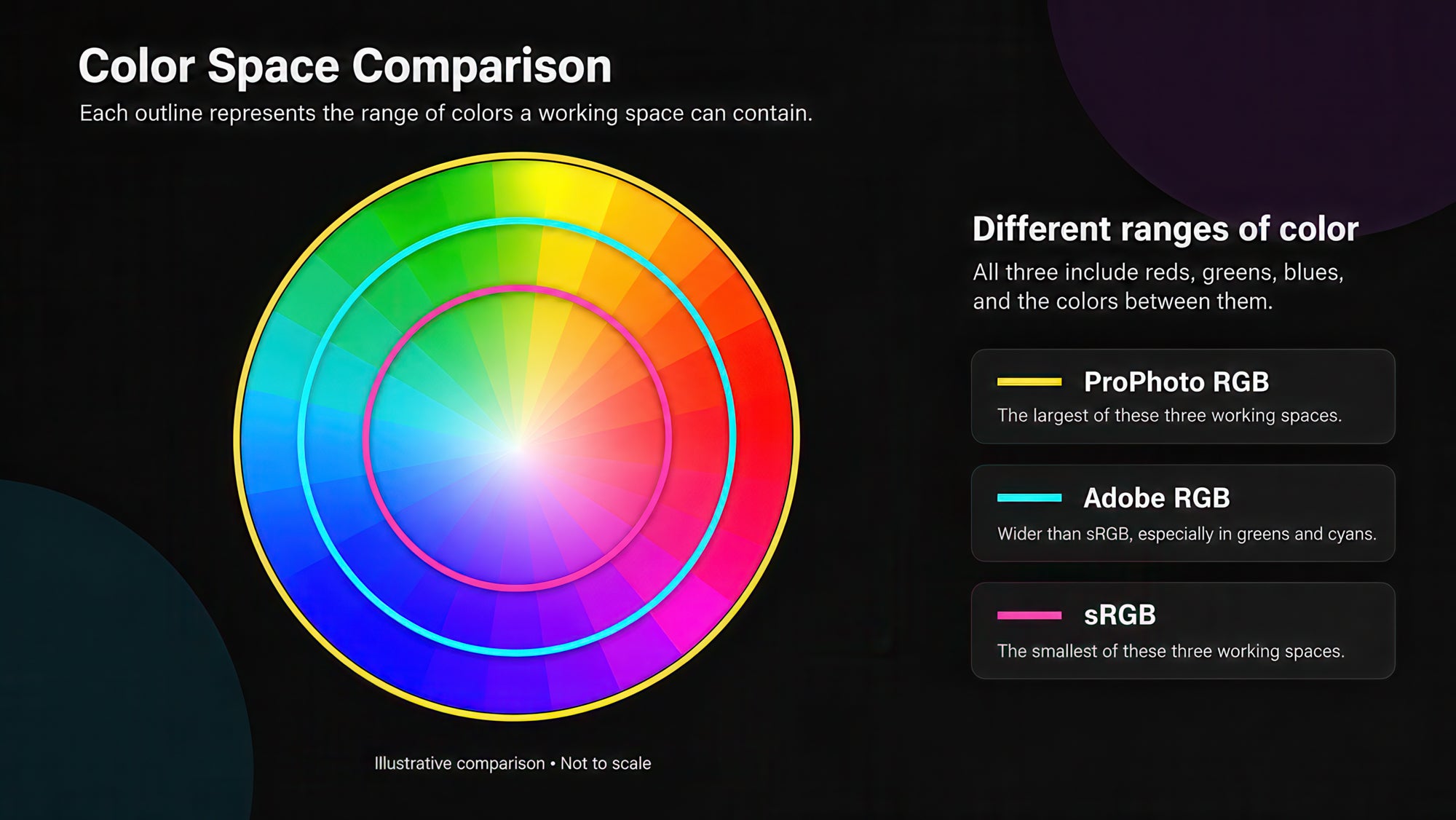
Two common color spaces photographers should know are sRGB and Adobe RGB:
-
sRGB is widely supported and a dependable choice for most online print orders.
-
Adobe RGB 1998 includes a wider range of colors, particularly greens and cyans, which some printing processes can reproduce.
Adobe RGB can work beautifully when the entire workflow supports it. Problems arise when a system interprets an Adobe RGB file as sRGB, which can make colors look dull or different than expected. For our online ordering workflow, use sRGB. If you work with another lab, check its requirements before exporting. Always embed the color profile. When changing color spaces, use “Convert to Profile” rather than simply assigning a different profile. Converting preserves the appearance as closely as the destination color space allows.
Soft Proofing
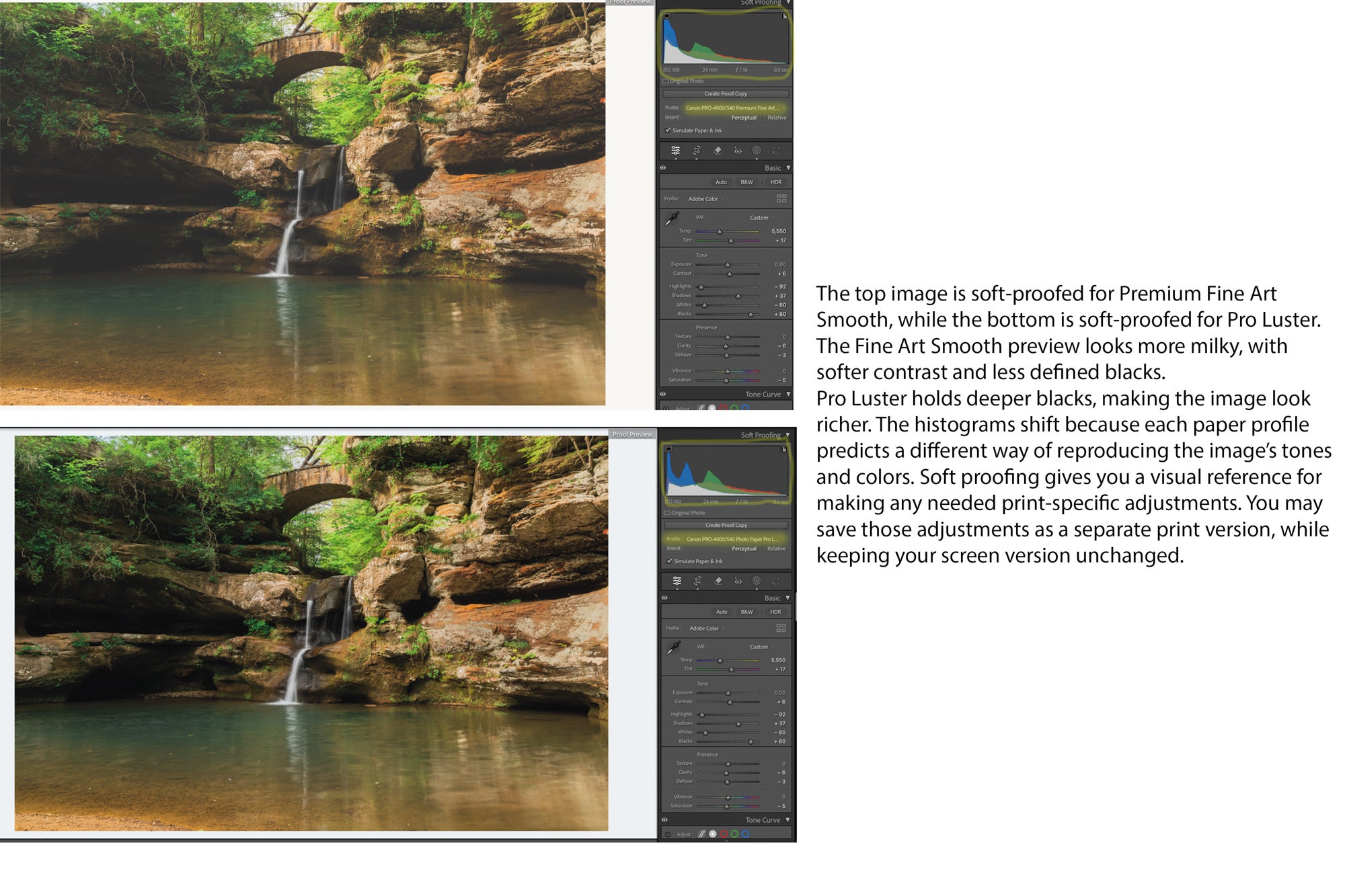
Soft proofing lets you preview how your photograph may look on a specific paper before printing, using an ICC profile for the printer and paper combination. You may notice shifts in color, shadow detail, highlights, or contrast. That’s normal. Your monitor can display some colors that the chosen print process cannot reproduce. Ask your lab which profile to use for soft proofing and which color space to submit. Those aren’t necessarily the same thing. Keep any print-specific adjustments separate from your original edit. Soft proofing is a useful guide, but it can’t fully show paper texture, reflections, or the lighting where you’ll display the piece. For an important print, a physical proof is still worth considering.
JPEG or TIFF?
“Should I upload a TIFF instead of a JPEG?”
We hear this all the time. TIFF files can preserve more information for editing, but that doesn’t automatically mean they produce better prints. A high-quality JPEG exported from your finished image can produce an excellent print, even at large sizes. JPEG uses lossy compression, so avoid repeatedly editing and resaving it. Keep your original and edited master, then create a fresh export when you need one. TIFF supports higher bit depths and can save without lossy compression. A 16-bit TIFF can preserve smoother color and tonal transitions and reduce the risk of banding during editing, particularly in skies and other subtle gradients. That makes it useful for master files and further adjustments. The trade-off is a much larger file. For most finished photographic print orders, a high-quality JPEG is a practical choice when your lab accepts it. Converting an existing JPEG to TIFF won’t restore lost detail or fix existing banding.
I’d much rather receive a properly prepared JPEG than a TIFF exported incorrectly. Resolution, color handling, and the quality of your edit matter more than the file extension.
PPI vs. DPI: What Actually Matters?
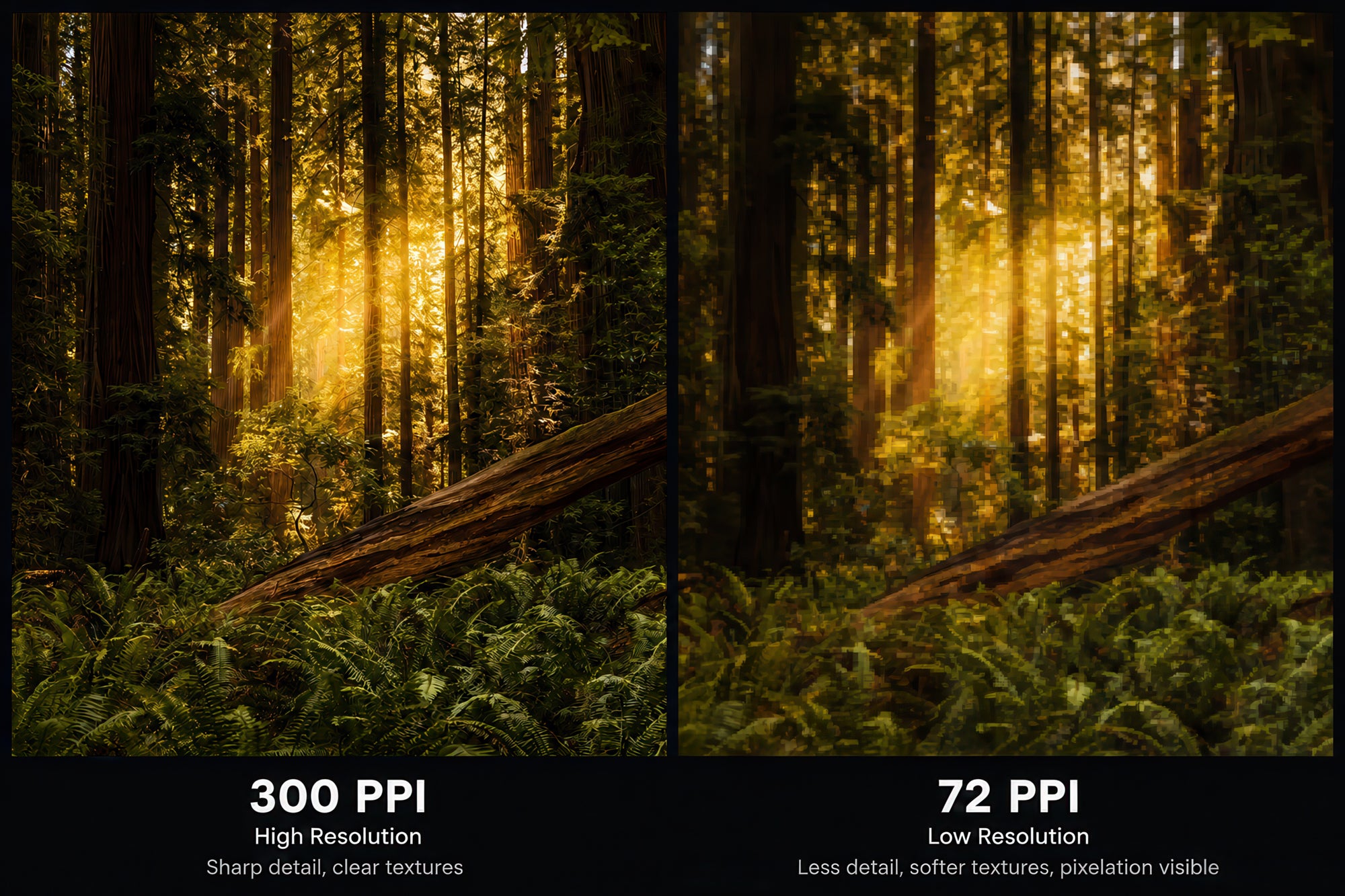
We hear “300 DPI” all the time at the lab, and we know what photographers mean. Technically, though, PPI and DPI describe different things. PPI means pixels per inch: how densely your image’s pixels are packed into the finished print. DPI means dots per inch and describes the printer’s output. When figuring out how large you can print, PPI is a useful measurement.
I’ve printed some of my own photographs at 40 × 60 inches at around 180 PPI. You don’t always need 300 PPI to make a beautiful print. Image quality, print material, and viewing distance all matter. Changing the resolution setting from 72 to 300 PPI without resampling doesn’t add detail. That’s why we don’t reject a file simply because it says “72 PPI.” We look at its actual pixel dimensions and the size you want to print. Resampling adds or removes pixels. Enlargement tools can help, but more pixels don’t automatically mean more usable detail. Always inspect the result for artifacts before printing. We also have a “How Big Can I Print My File?” tool on our website. Bookmark it for the next time you’re preparing a photograph for print, even if you’re not using us for your order.
Choose A Size Based On The Photograph
PPI gives you a starting point, but you still need to look at the image. We’d rather print a sharp, properly exposed photograph at 200 PPI than a blurry one that technically meets 300 PPI. Consider how the piece will be viewed. A small print held in someone’s hands invites close inspection. A large piece above a sofa is usually viewed from farther away, although gallery visitors may walk right up to it.
Focus, motion blur, noise, cropping, and editing quality all affect how far you can enlarge a photograph. Sometimes a smaller print preserves what makes the image work. Other times, going larger gives it the impact it deserves. If you’re unsure, send your lab a full-resolution export and explain what you want to make. Use your original edited file, rather than a screenshot or social media download, and ask for an evaluation before ruling out your preferred size.
Sharpening For Print
An image that looks sharp on screen can appear softer in print. Paper texture, print size, and the printing process all influence how detail comes across. Output sharpening helps compensate for that. Apply it after sizing your image for print, with the final material in mind. Matte papers generally benefit from more sharpening than glossy surfaces. More isn’t always better. Watch for bright halos around edges, exaggerated texture, and noise. Sharpening should bring out detail without making the processing obvious. If you’re unsure, ask your lab whether it applies output sharpening so you don’t double up.
Choosing Your Paper
Paper changes how a photograph feels. Texture, sheen, and the depth of the blacks can make the same image look dramatically different. Here are a few options we work with:
-
Luster: Slight texture and sheen, with strong color and contrast. A versatile starting point for many photographs.
-
Glossy: A smooth, reflective surface that gives colors and contrast a rich appearance. Fingerprints and reflections are more noticeable.
-
FineArt Baryta: Deep blacks, rich contrast, and a glossy, textured surface.
-
FineArt Pearl: A pearl finish with a softer sheen than high-gloss paper.
-
Photo Silk Baryta X: A silk-gloss surface with a subtle texture.
-
Photo Rag Metallic: A high-gloss metallic finish with a silvery shimmer.
-
Photo Rag Ultra Smooth: A matte finish with a very smooth surface for a clean, understated presentation.
-
Museum Etching: A matte paper with pronounced texture and a watercolor-paper feel.
Think about what supports your photograph. Would texture add to the atmosphere or compete with delicate detail? Does the image depend on deep blacks and strong contrast? If you’re unsure, compare samples or test your image on a few papers. Seeing your own photograph printed tells you more than a paper description ever could.
Canvas Or Metal?
Paper isn’t your only option. Canvas and metal each give a photograph a different presence on the wall. Canvas adds texture and a painterly feel. For a gallery wrap, consider the edges: part of the image may wrap around the sides, so leave room around important subjects or discuss alternative edge treatments with your lab. A glossy metal print offers vivid color, deep blacks, and a sleek presentation. Reflections can be noticeable, so consider nearby windows and lighting. Other finishes are available if you prefer less gloss. Choose the material that supports the photograph and works where you plan to display it. Seeing samples in person makes that decision much easier.
Don’t Forget The Frame
A simple black frame and white mat can look fantastic. But exploring different mouldings, mat colors, and mat widths can change how a photograph feels. A textured frame might echo the trees in a woodland scene. A muted mat can draw out a subtle color in the image. A wider border can give a busy composition room to breathe. The right combination keeps your attention on the photograph. Custom framing also lets you build around the image’s proportions instead of cropping it to fit a ready-made frame. You’ve made deliberate choices about the composition. The framing should respect them.
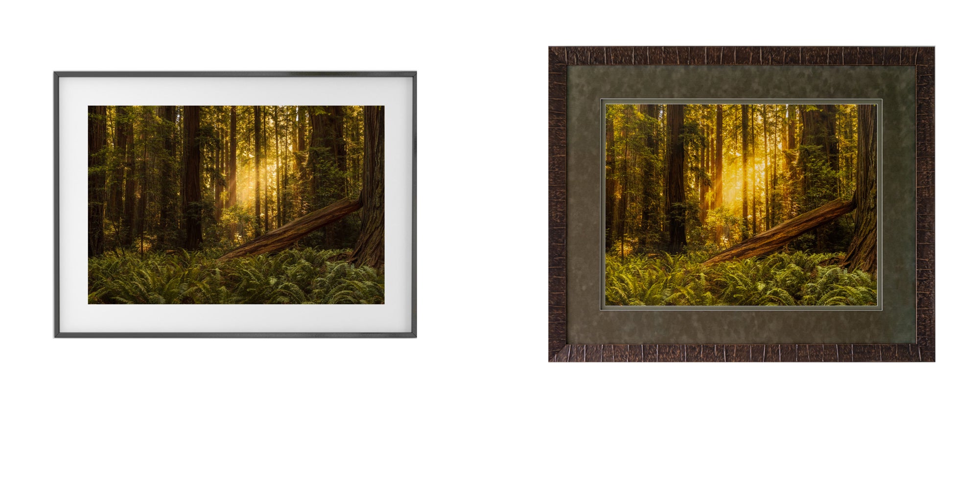
Presentation is only part of the decision. Ask your framer about conservation materials, appropriate mounting, and glazing options that suit the piece and where it will hang. Not every photograph needs an elaborate frame. Sometimes a simple approach is exactly right. The goal is to give the image a finished presentation that feels intentional.
I Hope You Have Learned Something New
A great print starts with thoughtful choices. Pay attention to composition and detail in the field, edit on a screen you can trust, prepare your file for the intended size, and choose materials and framing that support the photograph. When you’re unsure, talk to your lab or make a test print. You don’t need to master everything before getting started. Pick one photograph you care about and print it. Hold it in your hands. See what you notice that you missed on screen. You’ve already put time into making the image. Give yourself the chance to enjoy it beyond the next scroll. Feel free to reach out if you have any questions.
See more of David Shockey's work on Instagram @davidshockeyjr and davidshockeyphotography.com. Check out his professional printing and custom framing lab at captureonlabs.com.