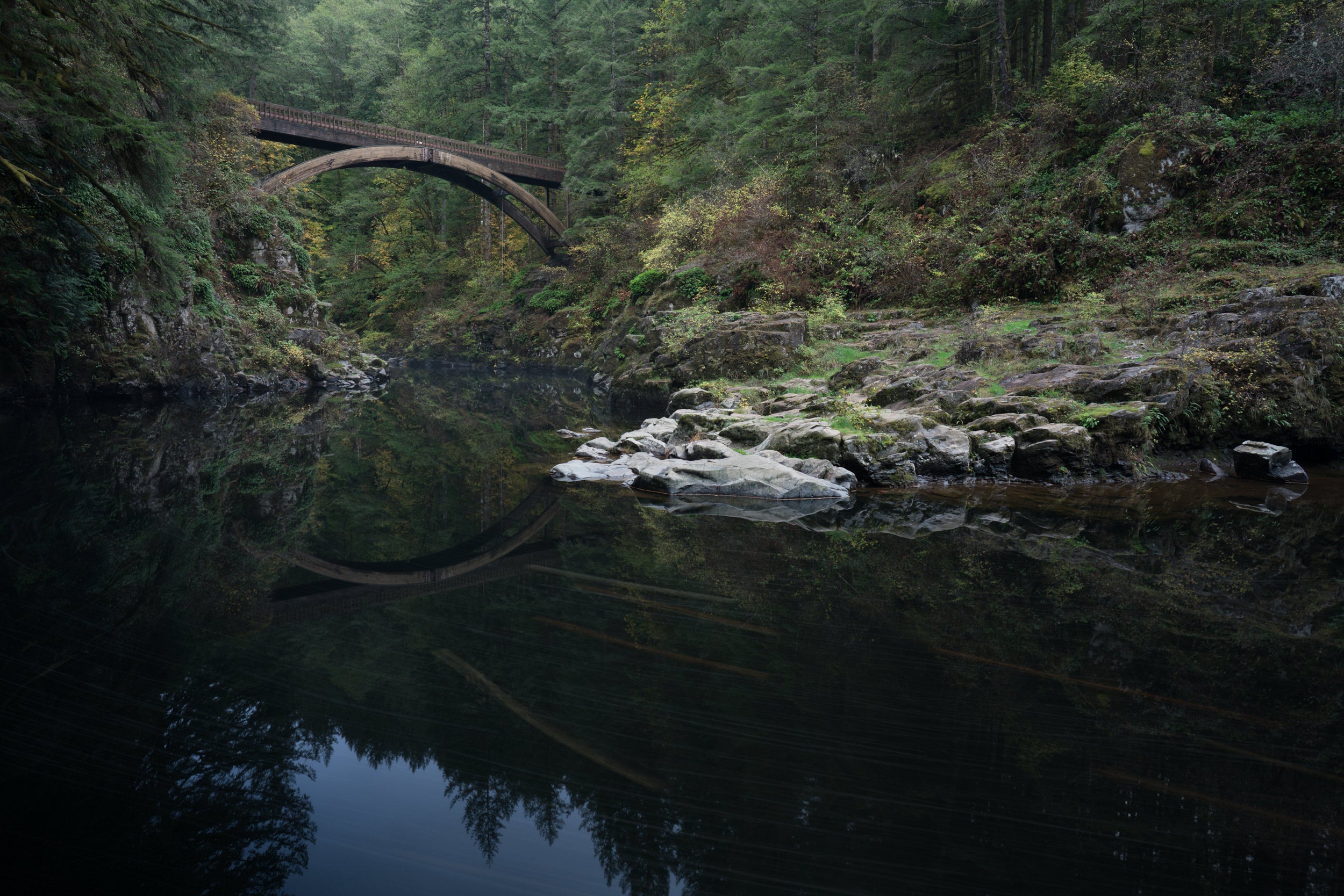
If there is one photo tip that I would stress more than almost any other—especially when we’re talking about composition—it would have to do with foreground elements. Too often, I see photos that don’t give the viewer a logical place to start exploring in the frame. When composing your frame, one of the things you want to keep in mind is laying out a visual path for your viewer to follow. Doing so will guide the viewer through the frame, exploring all of its intricacies or simplicities. Without it, the viewer is left stranded, not quite sure where to begin or where to end. These two photos illustrate my point. Let’s start with the unprocessed, SOOC, photo. Notice how it doesn’t have any foreground elements.

All I included was a lot of dead space from the slowly moving river. Your eyes get lost in that area and quickly jump to the top of the frame, where the bridge is. Now, look at the featured image above. In this frame, I lowered my camera to include some of the rock that I was standing on. Not only does this add a perfect starting point for the viewer, it also creates a sense of directionality with the river, giving the eyes a cue to follow its path upstream to the reflection of the bridge and then to the bridge itself.
A photo tip like this may seem basic or obvious but it’s this sorts of reminder that often pay back with dividends.


