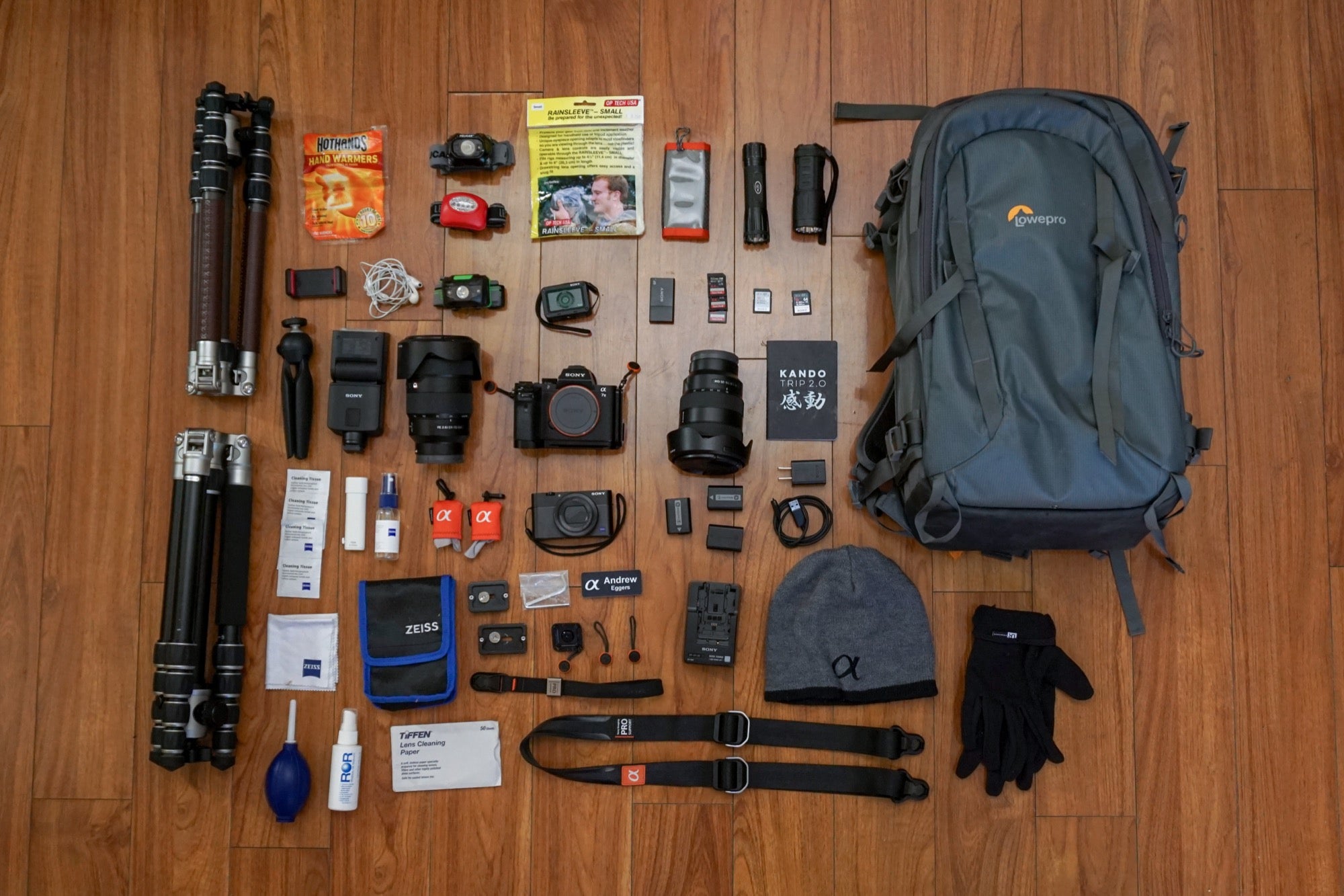
My name is Andrew Eggers (@andreweggers). I’m a member of the Sony Alpha Imaging Collective and night-sky astrophotography is my biggest passion. I use Sony cameras and lenses to capture the images in the field, but that's just the start of the process for me. Processing an astro-photograph is where I bring all of the detail captured by the camera to life and fully recreate what it was like to be there in the moment when I took the photo. Astro-photographers are always looking for better tools to bring the most out of the image files. Recently, I switched to Capture One 20 because at Kando Trip 3.0 in Oregon, I learned that the software could be a better match for my Sony camera and lens profiles which preserves and helps recover as much information as possible in the RAW files. When shooting the stars, it is imperative to get the maximum amount of information possible because you are overexposing every shot in the first place and you’ll need to recover details in post-processing (NOTE: Through April 30, 2020, Capture One for Sony is 25% off the regular price). Here's a look at how I'm doing my image processing now.
My overall goal in editing is for the image to come across mostly realistic to the naked eye while highlighting certain details and colors to make the image ‘pop’. This approach suits my personality because like many artists, I feel like I’m a realist. I truly appreciate those who can edit more dramatically and cinematically as well as composites, it’s just not my particular style.
With that said, let’s get to a Milky Way photo taken last summer in Bryce Canyon National Park of my friend, Marcus, holding a powerful flashlight pointed to the sky. I was using the α7 III and 24mm G Master lens on a road trip to a handful of national parks in Utah. The settings were 15 seconds, f/1.4 and ISO 4000 and it was a super dark night during new moon.
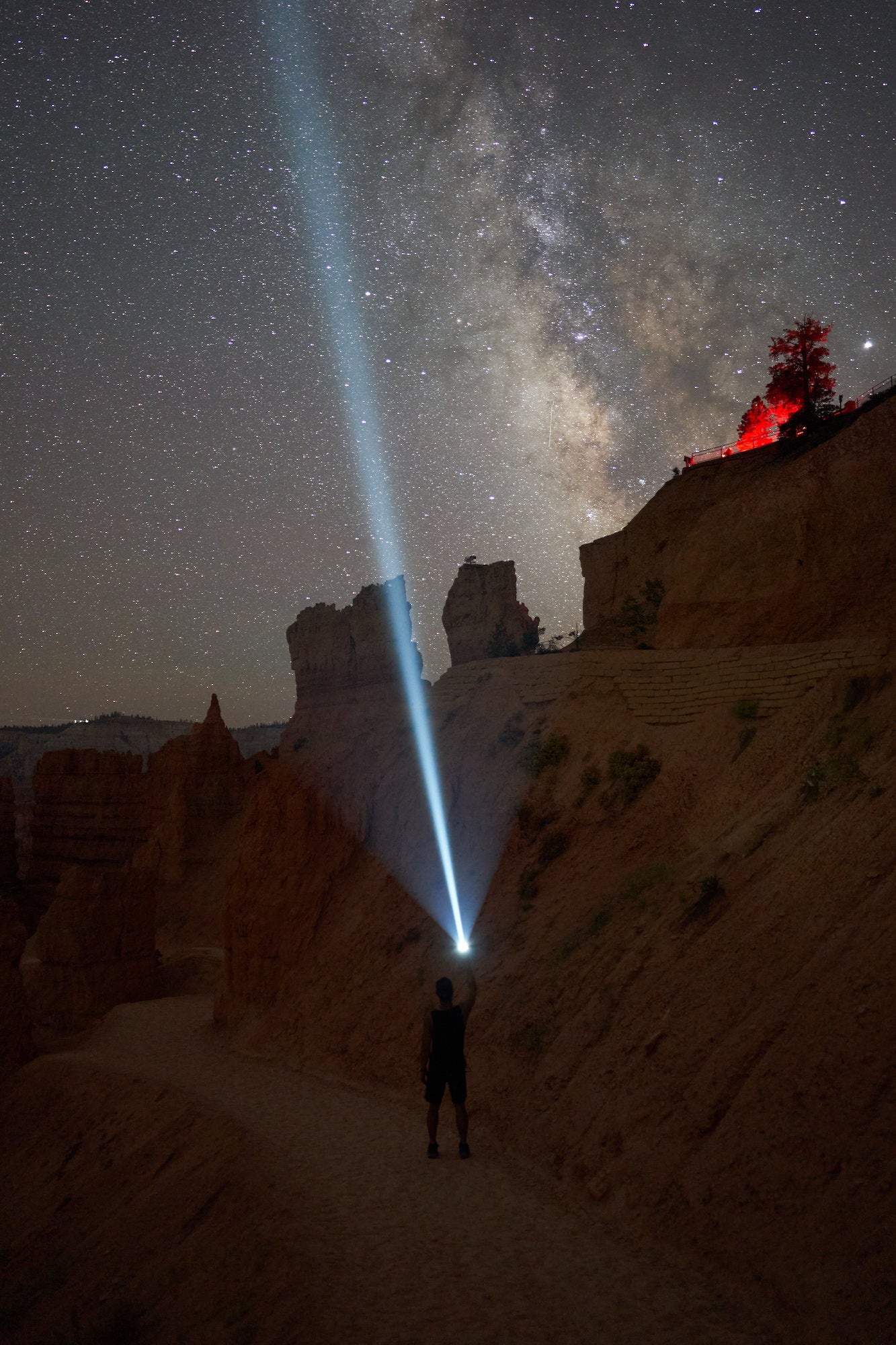
Sony α7 III. Sony 24mm f/1.4 GM. 15 secs., f/1.4, ISO 4000
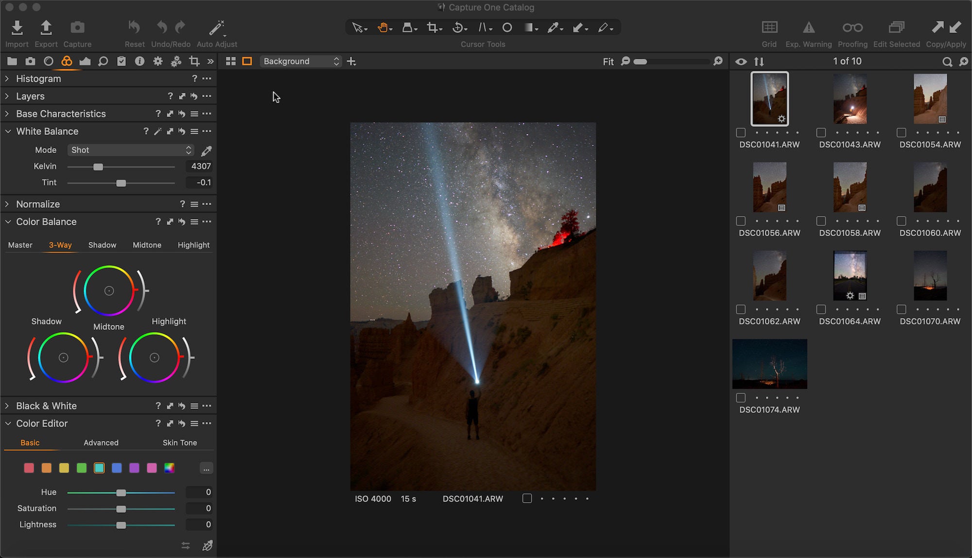
The original photo was a bit too green as I preferred a cooler sky, but also wanted to keep some vibrancy in the orange terrain when adjusting the white balance and tint. Then I bumped up the exposure, brightness and saturation while considerably dropping the highlights and boosting the shadows – a habit in almost every picture because it really helps bring out details with the dynamic range of the Sony cameras. My usual settings while shooting astrophotography are anywhere from 15-20 seconds and between ISO 3200 and 5000, with either f/2.8 or lower depending on the lens. The photos will typically look a bit dark in the LCD screen while on location, but that can all be taken care of with editing.
White Balance & Exposure
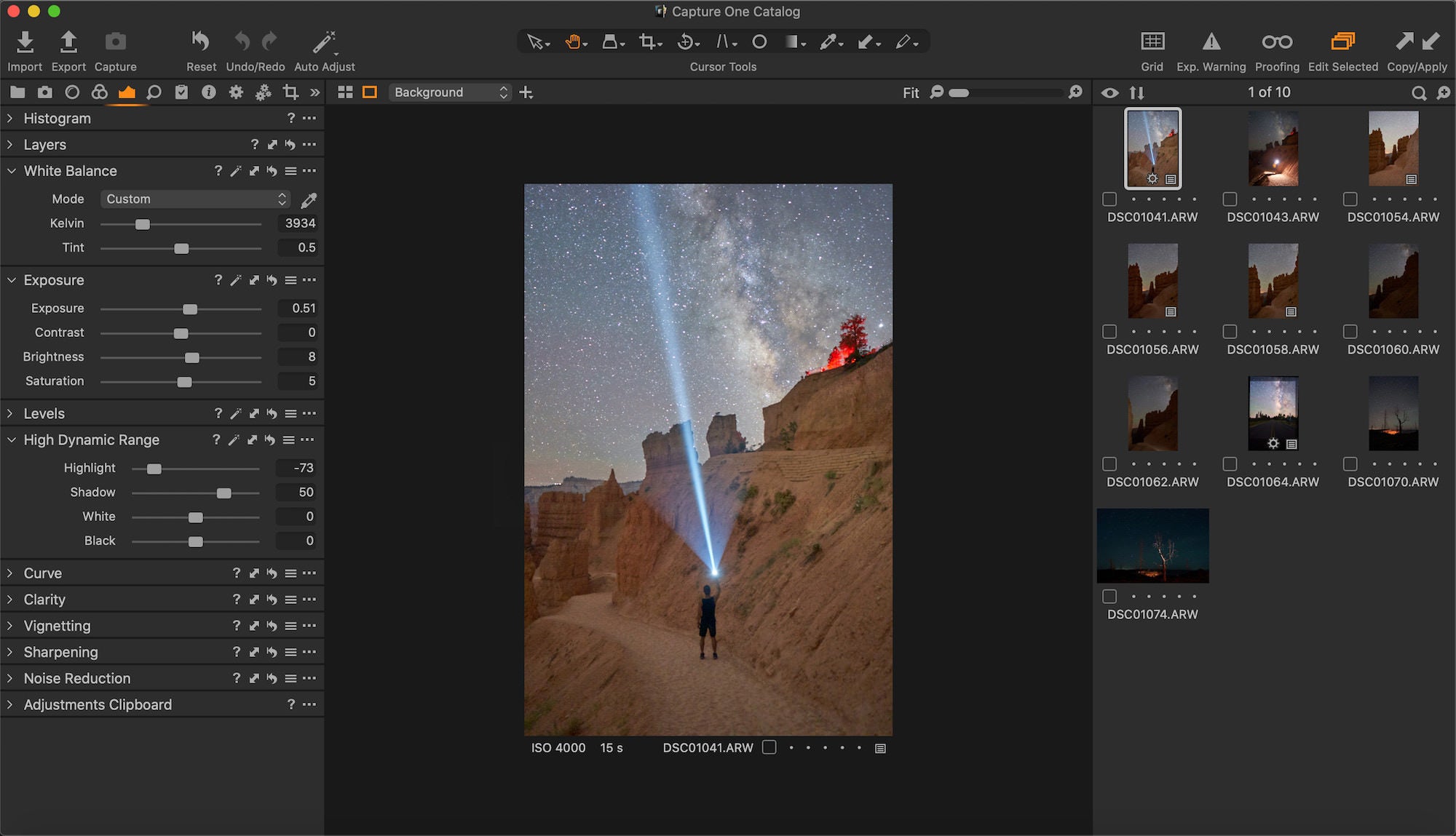
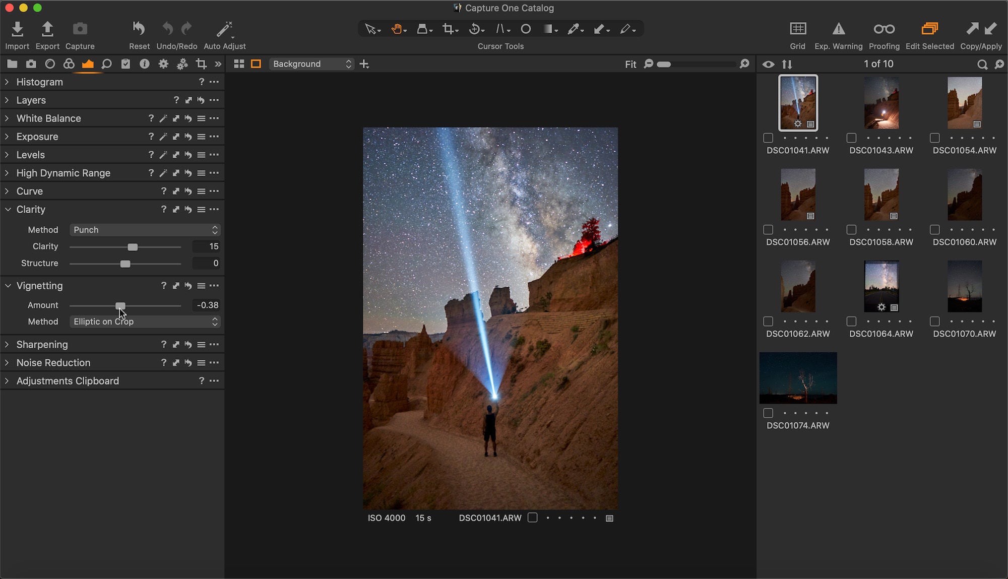
With a dash of darkness in the shadows and a bump to the highlights within the RBG tone curve, it was time to add a touch of sharpness and noise reduction. After learning somewhere in a tutorial that it is good to use the ‘auto-adjust’ for the levels tool, I do it every time now. To top it off, I sprinkled in a little ‘punch’ clarity and vignetting to round out the recipe to the local adjustments.
Tone Curve
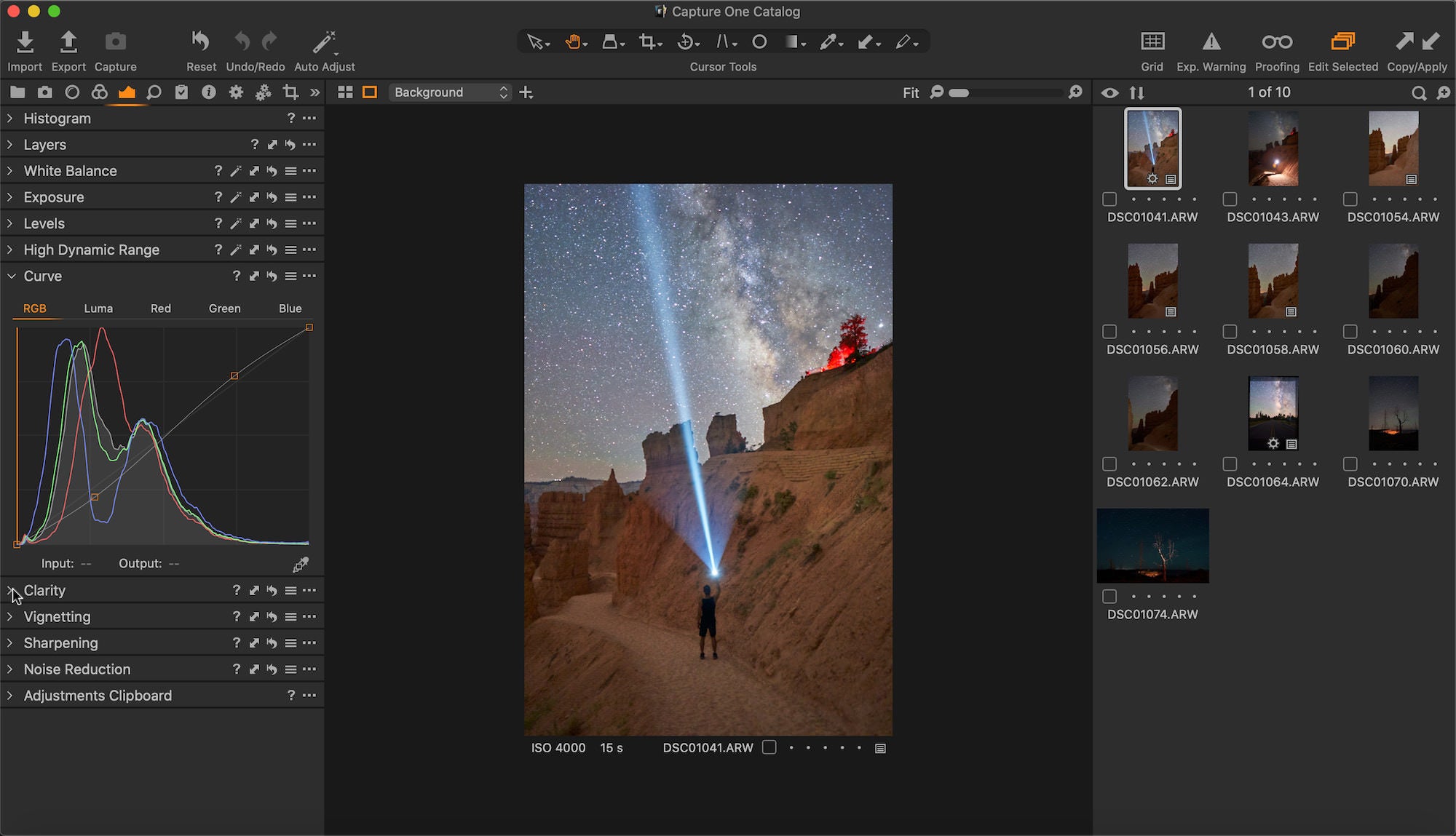
Levels
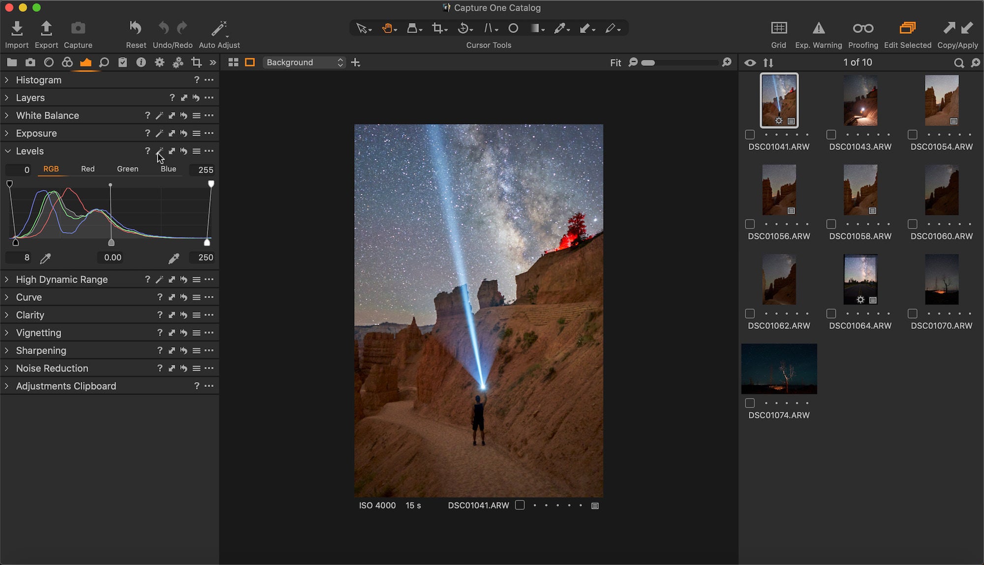
Clarity & Vignetting
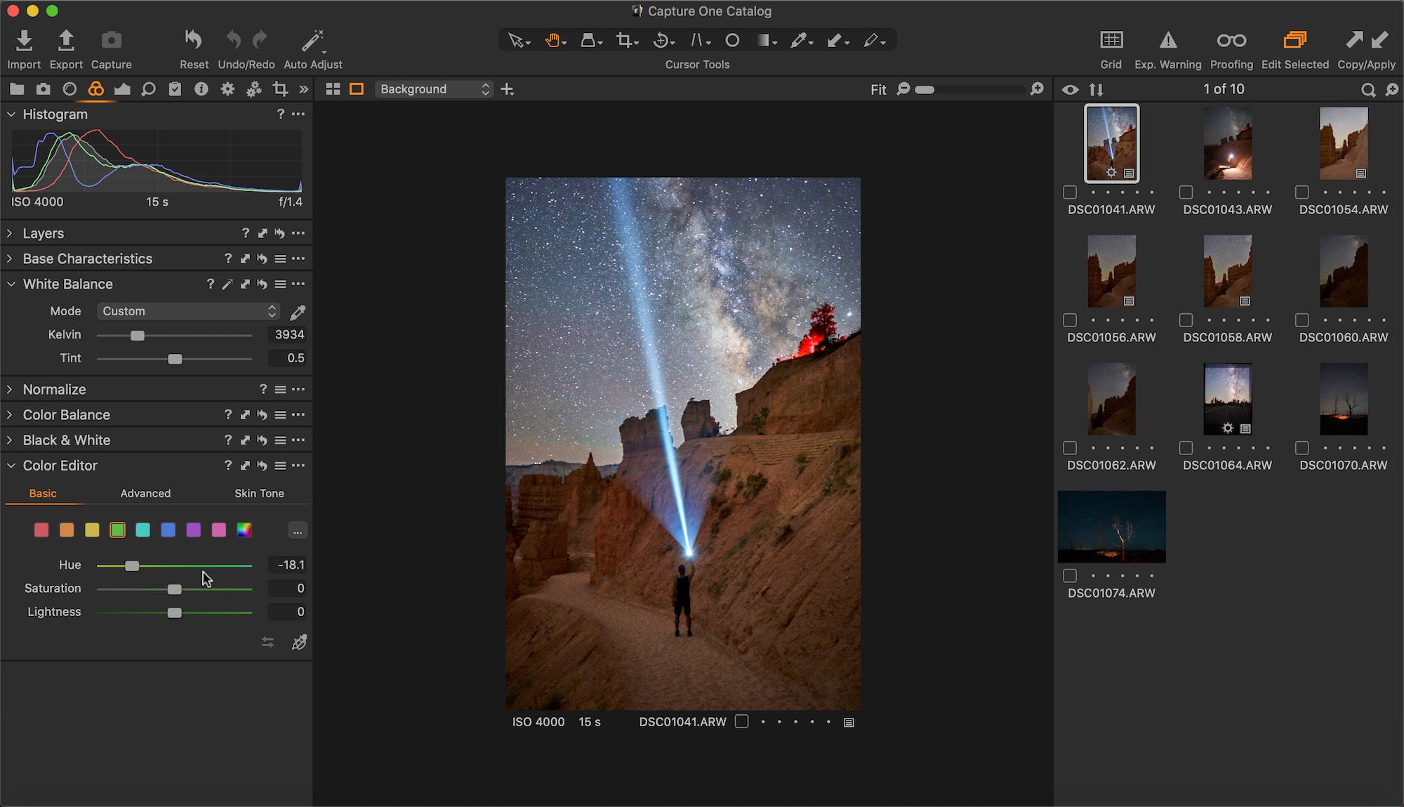
The colors didn’t look quite right, so the color editor was used to alter the hue and saturation of specific colors with the primary focus of shifting the green hues more to yellow and the teal hues more to blue.
Color Editor Green to Yellow
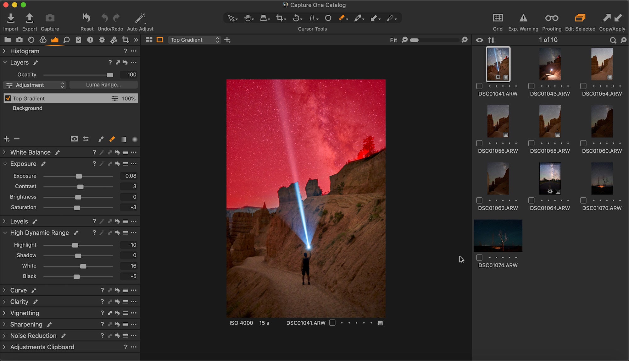
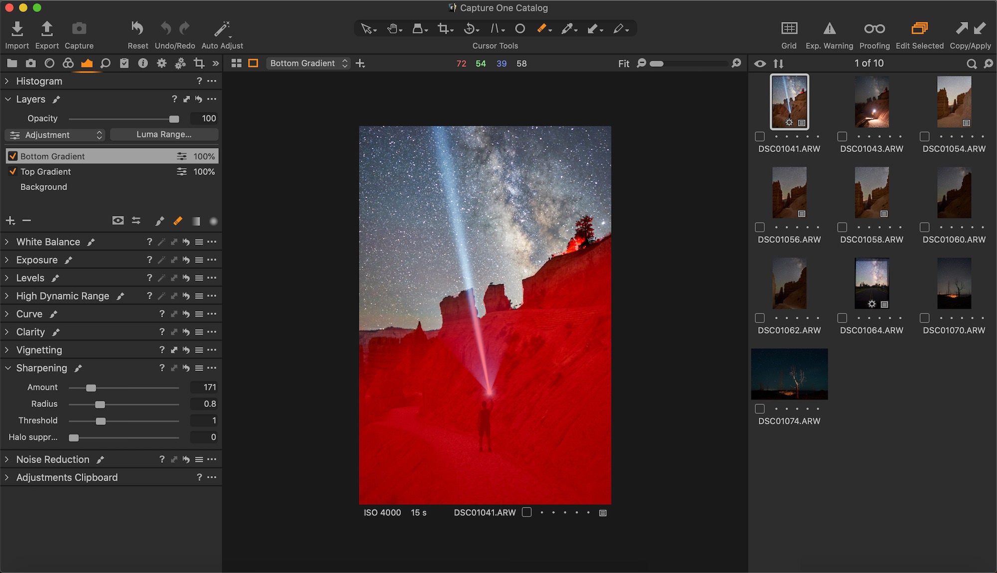
It was then time to use gradient filters for both the sky and foreground within the layers tool, both separated at essentially the horizon line that happens to be a bit diagonal in this photo. For the sky, I made small tweaks in the ‘exposure’ and ‘high dynamic range’ tabs, but mostly added some yellows in the highlights within the ‘color balance, 3-way’ tool. I didn’t have a lot to change in the lower gradient filter other than some sharpening and slightly warming the white balance so the orange rocks looked more natural. It was necessary to rasterize the masks in order to manually brush out the filters in certain places where the terrain overlapped the sky.
Upper Gradient
Lower Gradient
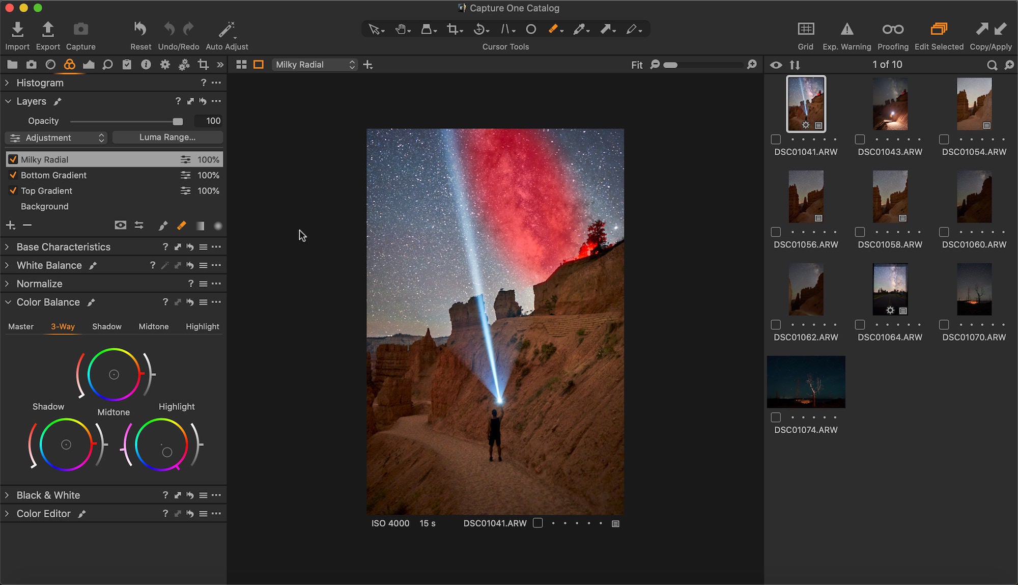
The photo still wasn’t quite right color-wise within the core of the Milky Way, so an inverted radial grad was necessary to add a little color, what turned out to be fuchsia, to the highlights in ‘color balance’. It looks best to me when the core is made of a mix of subtle colors like it does when you see it in person. The radial grad tool was very easy to use and control the size/shape, with three rings for adjusting making it a favorite tool of mine. It is also worth noting that all the essential tools can be adjusted in each added layer, such as exposure, high dynamic range and color edits. Only a few tools like vignetting are not compatible and that is easily taken care of by using a gradient, so no worries there!
Milky Way Radial
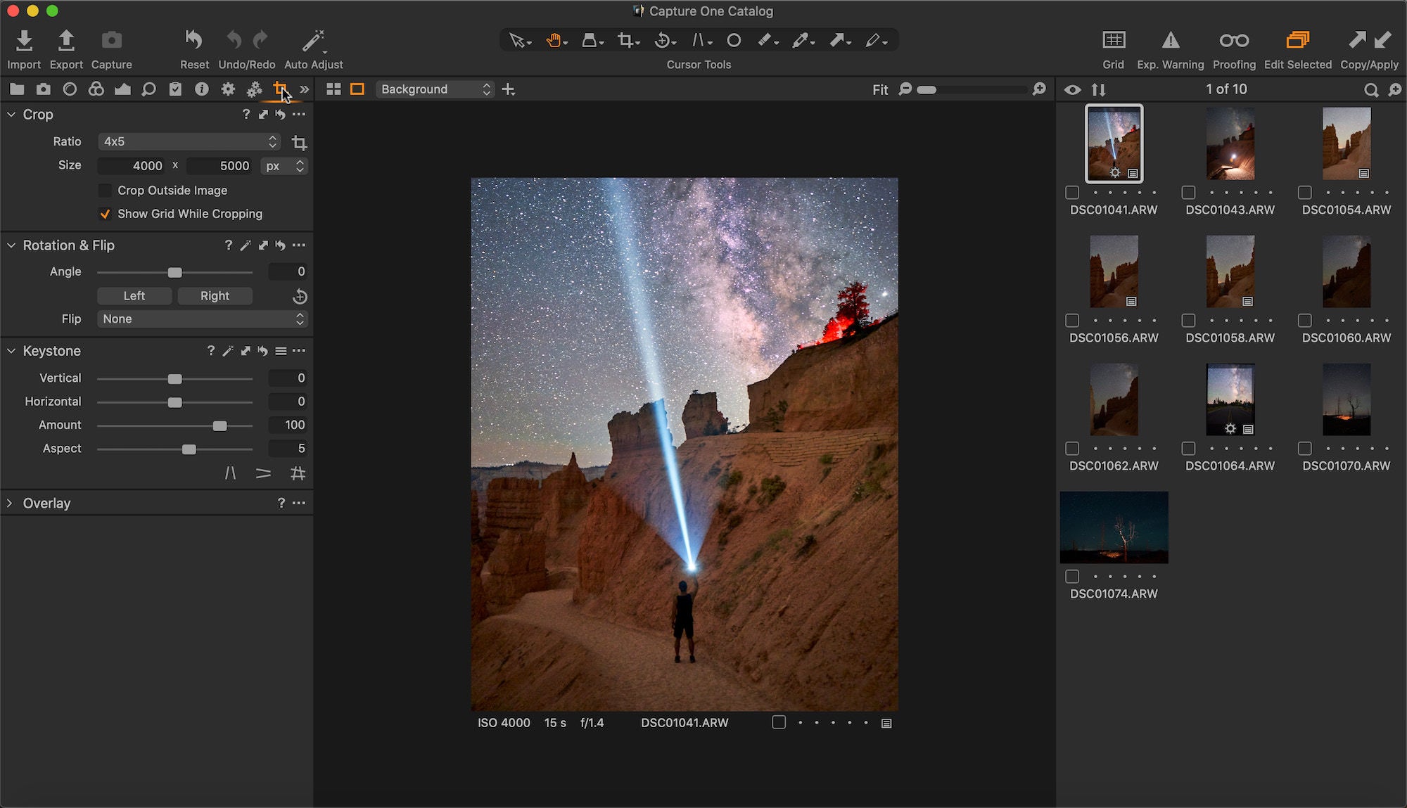
This astro edit was ready for export after a quick spot heal on an out of place rock, some overall sharpening, noise reduction in luminance and a 4x5 crop with five notches to the right on the aspect ratio to better proportion things.
Sharp, Noise, Spot

Crop
Overall, it has been a pretty seamless transition using Capture One 20 and it is now my preferred editing software. An edit like this one shouldn’t take me more than 30 minutes at the most, granted I get it right the first time. Thanks for reading and you can follow my photography journey on Instagram (@andreweggers).
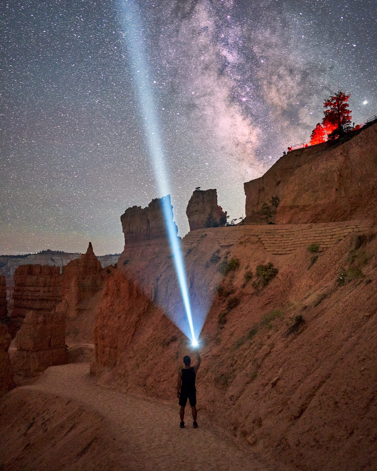
Sony α7 III. Sony 24mm f/1.4 GM. 15 secs., f/1.4, ISO 4000
Learn more about Andrew's gear for astrophotography here.
