A quick scroll through Instagram reveals plenty of bright, deeply-saturated photos. Of course, the Instagram filters make it easy to boost the colors in a photo, but it’s easy to go too far and create a photo that loses its connection to reality. I prefer to take things in a different direction (you can see more of my photography @philngyn) by muting colors and toning down the saturation. I think this creates images that are both closer to reality and, in contrast to the many deeply-saturated images flowing through our feeds, will stand out from the crowd precisely because they are turned down. A more subtle palette can speak loudly. When I’m in Thailand with fellow members of the Alpha Imaging Collective this week, I’ll be reigning in the saturation to make images that convey my sense of the place. Here’s how to do it.
My Gear
Getting to know the tool that you’re going to be using is the most important step in creating a great image, no matter what tool you use. Sony cameras have really stepped up the color science game as of late. I personally use the Sony Alpha α7 III for all of my personal and professional work and the skin tones and color reproduction have been nothing short of amazing thus far.
Camera Settings
Let’s first go over and review some key settings for your camera to make your post-processing a lot easier for you later on:
Image Quality
We want to make sure that we are shooting RAW so that we have the most amount of detail to work with later on in post. Whether you decide to shoot Compressed or Uncompressed is up to you and how much disk space you have.
Color Space
The world's de-facto color space for online images and printing is sRGB. This means that the colors you see and capture will be consistent across all devices. AdobeRGB gets a little more advanced and can only be seen on monitors that support it. So while you do get a wider color space with AdobeRGB, it takes a couple of extra steps to get it right that usually aren’t worth the effort. Keep it simple and stick with the standard, sRGB.
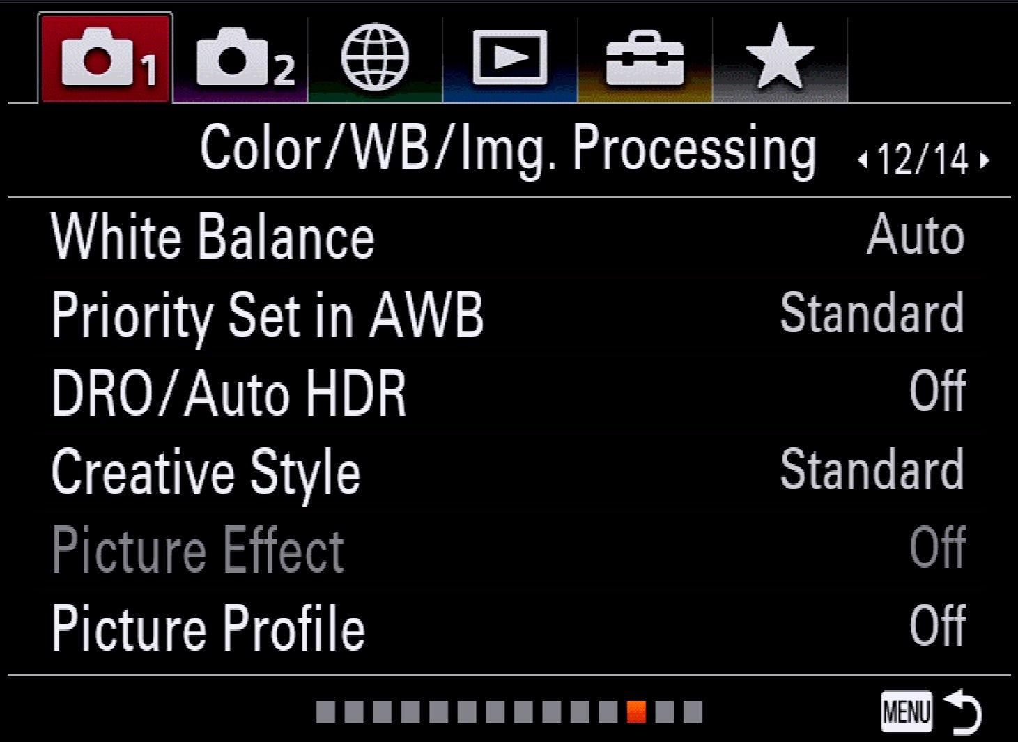
The following settings are my typical settings for color, white balance and in-camera processing. In my Sony Alpha camera’s menu, these settings are all on the Color/WB/Img. Processing page which is Camera Tab 1 and page 12/14.
-
White Balance: Auto
-
Priority Set in AWB: Standard
-
DRO/Auto HDR: Off
-
Creative Style: Standard
-
Picture Effect: Off, greyed out in RAW
-
Picture Profile: Off
While I won’t go into too much detail about exposure settings or the exposure triangle in this article, I will say that I find it important to shoot my images a tad bit darker than how’d I usually want the final image to look. This is to ensure that I don’t blow out any highlights that would be harder to recover in post. And with my α7 III’s full-frame sensor, I am able to bring up an ungodly amount of shadows because of its incredible dynamic range.
Editing Color
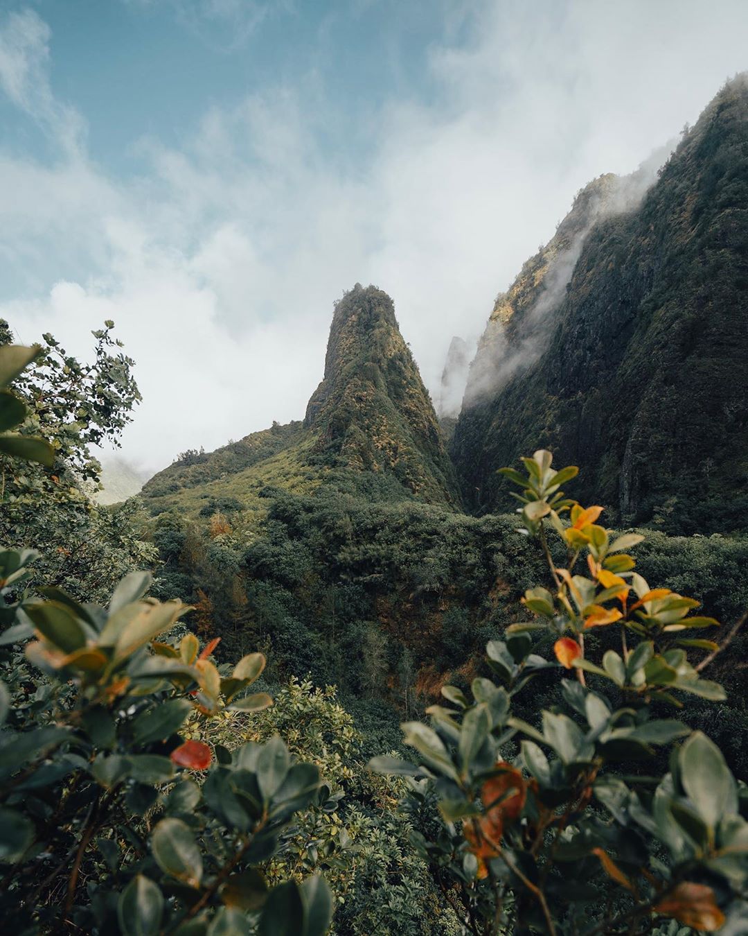
Understanding Color in Photography
Here’s where we will go into the meat of the article. It is important to first have a basic grasp of color and how it all comes together in post-processing. The RGB Color Model is the standard language of color in photography. RGB simply defines the primary colors for this model which are Red, Green, and Blue, with an entire range of colors produced by combining the three primary colors to produce secondary colors.
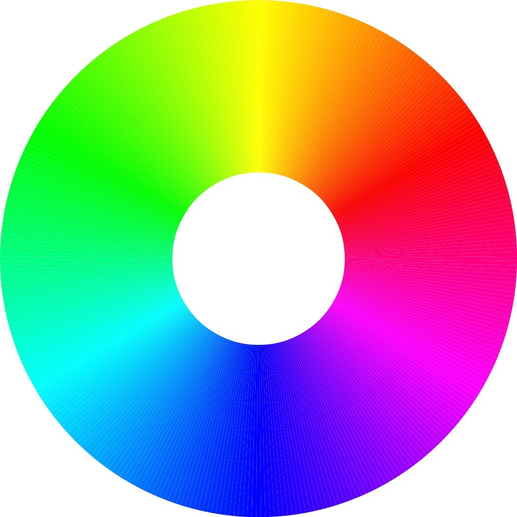
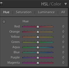
Photo editing programs, such as Adobe Lightroom and Photoshop, will then use the RGB model to break colors down into three categories: Hue, Saturation, and Luminance:
-
Hue: The general shade of a color.
-
Saturation: The intensity of a color.
-
Luminance: The brightness of a color.
Applying Color Theory
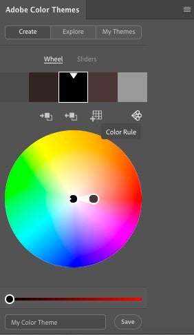
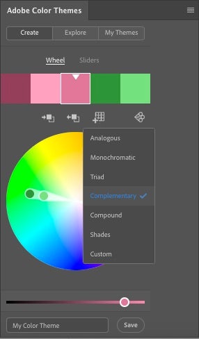
As a general rule of thumb, the most inefficient way to tweak colors in your image is to solely depend on the global saturation slider. Instead, I prefer adjusting colors individually or groups of colors that correspond to each other using color theory concepts. I will briefly go over three standard color rules that can be applied to your images and help you go about your editing. In Photoshop, start by accessing the Adobe Color Themes panel by going to Window>Extensions>Adobe Color Themes.
-
Monochromatic: Here, all the colors are different shades of the same color. Each color is from the same line of the color wheel.
-
Analogous: This is similar to Monochromatic except it is a bit more spread out on the color wheel. Basically, it’s a harmonious combination of colors that touch each other on the color wheel.
-
Complementary: Colors that complement each other by being opposites. These colors are based on hues that lie across from each other on the color wheel. This color scheme is most widely used in cinema and one I tend to lean on the most.
General Tips
Keep It Natural – Selectively Adjust
Usually, efforts to adjust color globally will throw off other colors in the image, sometimes making for bizarre combinations that might look unnatural or unintended in your image. If globally adjusting your colors has caused any color to go off the rails, then you will need to target it selectively.
Saturated colors can easily overwhelm an image, therefore limiting certain tones and textures, and distracting from the original intent of the image. By keeping color saturation in check, you can allow more subtle, but impactful characteristics of an image to show instead of being drowned out.
Add Some Flair – Split Toning
Split Toning technique that I use consistently to add a bit of flair and color to my images without saturating the main colors. Here, I tend to lean heavy on the Complementary Color Scheme as discussed earlier.
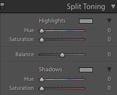
As a rule of thumb, there is an optical tendency of warm hues to pop and cool hues to recede. As with light and shadow, the human eye will be attracted to warm hues in the same way that it is attracted to light in a darker image. By applying the concept of the complementary color, you can create more separation to further differentiate the tones and create more depth in the image.
Try Something Different

As the old saying goes, rules are meant to be broken and while it is important to understand the concepts and visualize how they work within the realm of photography, it is ultimately up to you and your eye to make the image stand out as much as possible while still being “you”. I hope you are able to apply the information and tips discussed above to your own images and create something truly unique to you. Happy shooting!


